It seems like forever since Apple launched its first generation iPhone back in 2007. The world has changed dramatically in a number of ways since then, and one of the biggest changes, as well as a driver of other change, is how we access information. Answers to questions are never further than a search away. Nearly anything can be purchased or sold with the tap of a screen, and your entire social and work life is available right at your fingertips.
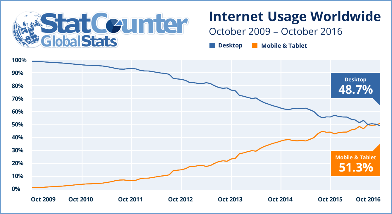
The internet is being used more now than ever before, and while billions of users around the world still use desktop and laptop computers for work and entertainment, the use of mobile devices to access the internet has surpassed the use of desktops and laptops since 2016.
Now, a more than a decade since the first popular smartphone made waves across the world, it’s more important than ever that your website can be viewed on any device. This is called responsive design, and it means that whether your visitors are using a desktop, laptop, tablet or phone, they can quickly and easily navigate and read your website.
Search engines now rank sites higher that are mobile friendly. Google in particular changed their search algorithm as early as 2015 to give preference to sites that run faster and function better on mobile devices. While Google is the clear king of the internet search world, others such as Bing quickly followed suit.
Showing up at the top of your audience’s search is critical! Forrester’s 2015 Report “Google-ize Your Site Search Experience” showed that 90% of potential visitors never go past the first page of results – that’s a lot of eyeballs that will never see your site if you don’t optimize your website to be responsive.
Attracting new visitors is only the first part of having a mobile friendly website. But if you’re like most marketers, the real goal is to keep visitors on your site, and that will only happen if your site is well designed to be used on a mobile device. That means three things:
If your visitors can quickly find what they are looking for on your website, you have happy visitors who are more likely to turn into quality leads – which leads us to the next point.
![What is this, a website for ants? [meme]](https://e5oerv4i7xg.exactdn.com/wp-content/uploads/2020/09/zoolander-phone-1.jpg?strip=all&lossy=1&w=2560&ssl=1)
This part is simple. If your users find your website easily and are able to quickly find what they are looking for, you have gone a long way towards generating goodwill and trust toward that visitor. That means your visitor is much more likely to return to your site in the future, but also take action by sharing your site on social media and even recommending your brand, product, or services to their friends. This, in turn, improves your brand’s digital footprint, and that means even more visitors to nurture and turn into better leads, faster.
