Need tips on how to design a logo? With a lot of experience and expertise, we can help guide your creative process in the most optimal direction. In our workflow at Sage Marketing, there are four main stages to designing a great logo.
The first stage is the most important, but also the least exciting: Research and Planning. It is important to research a variety of factors, from competitors’ logos to color schemes and meanings to your (or your client’s) company’s mission statement. The second stage gets into the interesting grit of logo design, where brainstorming ideas based on the research are sketched out in many iterations to arrive at a usable concept. The third stage transfers the best usable concepts from the second stage into clean, digitized mockups for review, selection, and final critiques. Finally, the last stage revises the best logo option into its final form(s) where it can then be extrapolated into a full and cohesive brand.
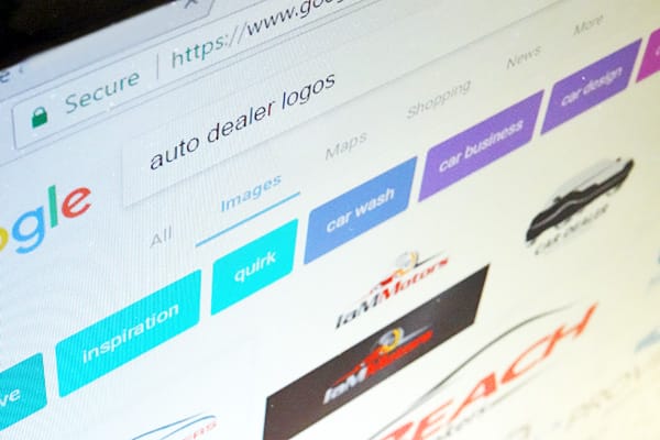
Knowledge is power. This is especially true in logo design. Jumping headlong into the visual design can be an exercise in frustration later on if the proper research isn’t done first to avoid some pitfalls. The company name needs to be available and should not invite legal battles later on. The same is true of the visual elements of a logo. Research competitors’ logos to ensure that, while your logo fits inside the landscape of the industry, it does not infringe upon the rights of existing logos in that industry.
Researching what TO DO is just as important as researching what NOT TO DO, however. Make notes of what successful companies have done with their logos. Which are the most memorable? The easiest to read? What are things that resonate with you, your company, or your client? Each industry has trends to pay attention to. Even color choice and color theory are important to impart the right message. After all, a logo is the most fundamental element of a brand, and it should speak the brand’s message loudly and plainly.
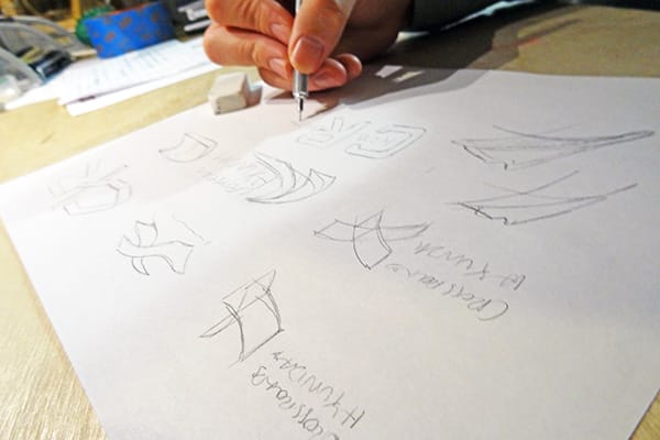
Taking the knowledge gained through the Research Stage, we then move on to the Brainstorming and Sketching Stage. The goal of this stage is to get as many ideas into visual form as possible. The real fun of playing around with visual elements begins here. This stage can be done either on paper, or in the computer, but the process in either medium should be free-flowing and non-destructive. Record any ideas that come to mind, all the while building on the most interesting ideas to work on in the next stage.
Keep in mind positive and negative space, dynamic versus stable lines, heavy versus light marks, and hard versus soft forms. These juxtapositions and interactions combine to form the base of the logo.
Basic principles of design and composition are very important to pay attention to in this stage. Different industries use different trends in shapes, colors, typography, and style, as mentioned in Stage 1. Think about how your logo interacts with those trends. Make it relevant to the industry, but also unique enough to stand out. When in doubt, simpler is better.
Once you have exhausted the explorations from this stage, narrow down the sketches to the best 3-4 to refine in the next stage.
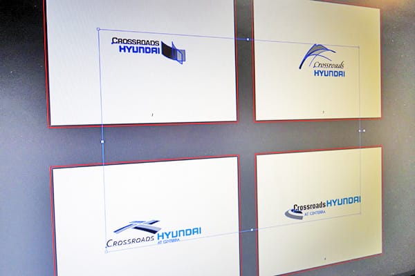
After the sketches are selected, they need to be prepared for proofing, and put into a form where final review is possible. Using computer programs, typically Adobe Illustrator, Inkscape, or similar vector-based drawing program, the logos are re-created. This makes them easy to scale and mass-produce. Any details or notes that were too granular for the sketches, but noted during the brainstorming session, should be incorporated at this point.
Typically, as the final logo forms are completed on the computer, the colors are kept black and white for initial reviews. Most logos will have to be reproduced in black and white for certain applications in the brand, and this ensures that the logo looks good for those applications as well. In addition, the 1-color black and white mockups can be a good way to review small details that might get lost if there is color. Any formal or stylistic issues can then be ironed out before the final logo options are selected for the company.
Once all computer mockups are finalized they can be sent to the client or passed around the marketing board for several rounds of review and revisions. Colors are finalized, and the logo is seen in both color and black versions. Once the final logo is chosen, there still may be some small revisions before it is ready for production.
This revision stage can seem tedious sometimes with much back-and-forth, but it is key to adding the final polish to the logo for the greatest success. You don’t have to take all the advice you hear. But, you should get as much input on the logo as possible, from as many people as possible, before the logo is released into the wild.
The final step of how to design a logo is to prepare it for reproduction. By using the vector-based programs we have done most of the work in Stage 3 and Stage 4. Make sure to save copies of the logo file in a variety of formats and color standards, such as PDFs with both CMYK and PMS color options. The logo is now the foundation for a strong brand, and is ready to be built upon. Integrate the logo into the brand strongly by keeping ties to the color-scheme, typography, and formal elements of the logo throughout the brand.